Footer Wine
Naming, Packaging
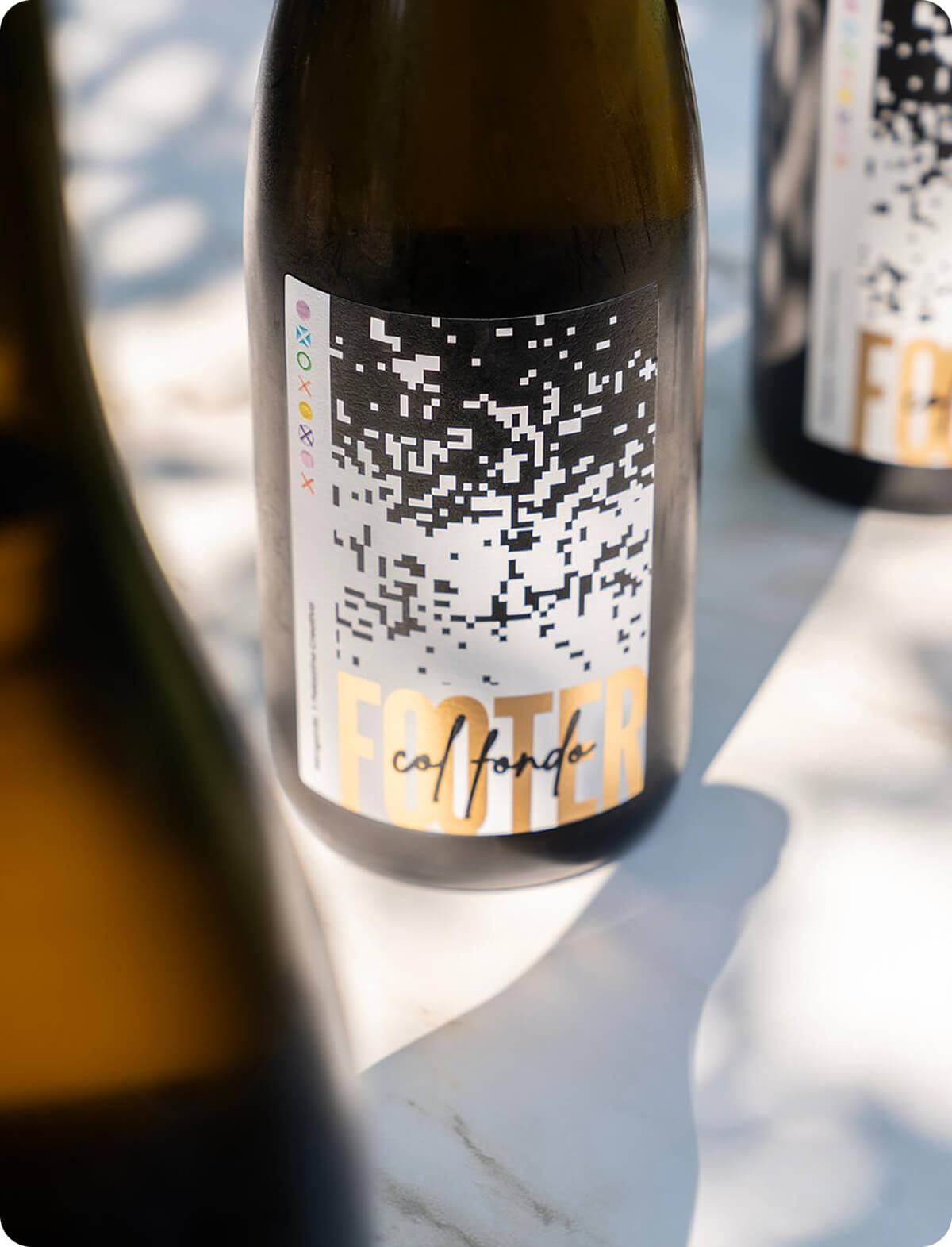
We wanted to create a wine that could also speak the language we use every day: digital. Nomen omen: Footer—the bottom of a webpage… and the sediment at the bottom of the bottle!
Here, the label isn’t just a graphic—it’s a system: one single source artwork (a large “carpet” of pixels) and variable data printing that generates a different result every time. How? By printing on HP Indigo and leveraging database-driven variable data logic together with the Mosaic plugin, to define which parts stay fixed and which parts are treated as variable data. That’s how we achieved a dense, recognizable top section and a bottom section that changes—where the pixels, as they fall, always land differently at the base… just like in the bottles.
That’s why every Footer is a unique edition: the label that can’t be missing from any respectable cellar.